Time Series Data Service FAQs
Everything you every wanted to know about the Time Series Data Service and how to use it.
Of course, this is a pity in the first place and we would appreciate your feedback why you decided against Proficloud.io. Just use our contact form for that. We strive to improve!
The Smart Services enable customers to import data from different devices (production plants, measuring devices, etc.) and from different locations (worldwide) into the Smart Service, operated on Proficloud.io in order to link them with each other and make them remotely evaluable.
For this purpose, the Smart Service enables standardized analyses based on the imported data and e.g. visualizes them with dashboards.
With our User Guiding, we want to make it even easier to get started with the various Smart Services. The guides offer interactive tours through the Smart Services to explain individual functions or to get an overview of the areas of a Smart Service.
In the video you can see how you can use the User Guiding and start interactive guides.
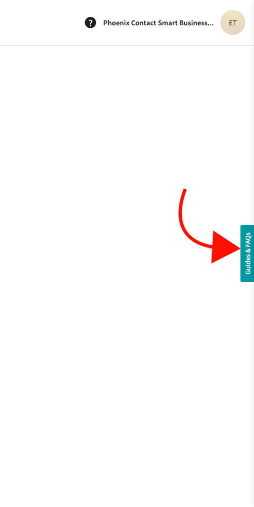
The first time you visit a Smart Service, you will be greeted by a prompt. You can either get an introduction to the Smart Service you just have open in the welcome, or access the guides again later at any time by accessing the button labeled “Guides & FAQs” on the right side of the screen.
We use a service on Proficloud.io that allows to conveniently display all FAQs and guides relevant to the active smart service.
To access the FAQs, just click on the button on the right side of the screen labeled “Guides & FAQs”.
Metric is just another name for variable. One example could be a temperature, wind speed, voltage etc.
As of right now, Proficloud.io is running in AWS data centers, located in Frankfurt. Phoenix Contact does not operate their own data center for Proficloud. Because all Proficloud.io data is hosted in Frankfurt, German law applies
Vulnerability scanning
We are using an web-application vulnerability scanner (Automated security and asset monitoring) to monitor the web-apps for potential takeovers and remediate security bugs in staging and production as soon as they are known and we are using products for automatically prove our code quality & code security.
Hardening techniques
We apply different hardening practices (like i.e. use of service packs, automatic dependency checks, patches & patch-mgmt, etc.) for our service-containers
GDPR compliance
Proficloud.io is completely GDPR compliant, thereby conforming to the highest data privacy standards.
Operating system
All our virtual servers are based on Linux, increasing the resiliency of our cloud system.
Spectre/Meltdown & know CPU security vulnerabilities
Infrastructure has been updated with these new protections, and no customer action is required at the infrastructure level.
Permission / user management
We‘re looking on rolling out a sophisticated permission management system throughout 2021, allowing companies fine-grained controls over what users are capable of accessing.
Password policy
High security passwords are enforced by the platform. In general the password needs at least 10 characters, upper & lowercase letters, number(s) and special character(s).
Public key infrastructure
We are using EJBCA as PKI for all tenants in Proficloud.io, allowing us to revoke potentially compromised certificates whenever needed.
Secure bidirectional device communication
CA signed remote commands are used regarding the connected devices. All communication is encrypted using TLS 1.2 and client certificate authentication.
Secure firmware update process for devices
Hardened firmware update process for devices with IEC 62443 measures.
Encryption
All connections between users and devices to proficloud are encrypted using TLS 1.2.
Data centers
Phoenix Contact Smart Business uses dedicated aws data centers for running Proficloud.io guaranteeing an industry leading security level for customers.
Some Proficloud.io services, such as the Device Management Service can be used free of charge. Other services, including Time Series Data Service allow customers to test them free of charge, but require payment for actual production workloads.
Cloud pricing ist often complicated, but that’s not the case for Proficloud.io. We always make sure to offer payment models, which are easy to understand, enabling our customers to always understand their true costs. This means for you that in the Time Series Data Service, for example, you pay per metric that you send to the cloud. With this model, we naturally offer you suitable packages, so that you have maximum freedom in cost calculation and can rely on the exact costs incurred.
In other services (e.g. ImpulseAnalytics) you only pay per device for one year. This is based on the business model, which was developed especially for this service and offers the user an easy way to calculate the costs.
As soon as you book a service, you will receive a booking confirmation by e-mail, as well as a booking confirmation within Proficloud.io. You can use the booked service directly after the booking. You will receive a separate e-mail with the conditions (taxes, legal framework) from Phoenix Contact that apply to you.
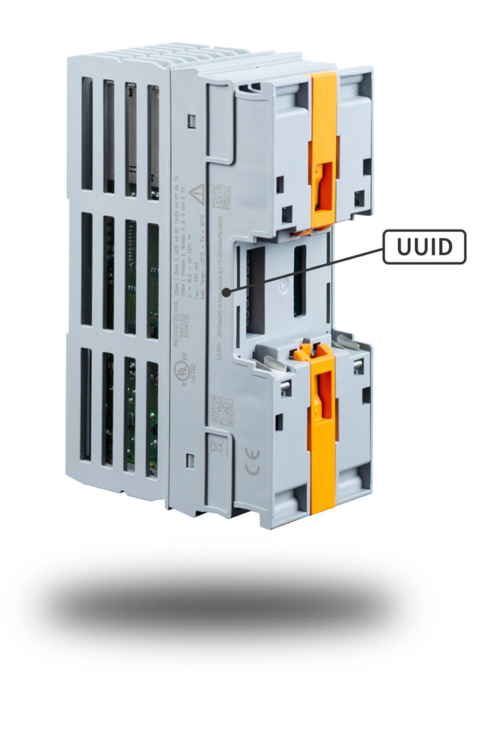
The UUID (Universally Unique Identifier) is required for adding a device to Proficloud. It is printed externally on the device’s housing. After the installation and commissioning of the device, the UUID may not be visible anymore. Thus, it is mandatory to document the UUIDs during the device installation.
We recommend to additionally document the respective device designation within your system or a unique, descriptive name for the device. This enables you to identify the device again within your system locally.
If you cannot access Proficloud.io, please contact your company’s IT. Security restrictions of your company’s IT may result in access problems to Proficloud.io.
An unrestricted internet connection is required for the following addresses and sub-adresses in case of port 443 (HTTPS) and port 8883 (MQTT over TLS):
Proficloud.io
Proficloud-production.io
This needs to be guaranteed by the company’s IT.
- Click on the profile icon in the upper right corner of the browser
- Click on [Settings]
- Click on the pencil on the right side of the browser next to your current e-mail address
- Now enter your new e-mail address in the field for the e-mail address and click on [Save Profile Data]
- Click on [Confirm] to confirm the action. You will be logged out and will receive a confirmation e-mail at your new e-mail address
- Click on the link in the e-mail to verify the e-mail-address change
See at a glance which devices can use which services. The listed devices are Phoenix Contact devices with direct Proficloud.io integration. You can integrate a lot more device with a Gateway Solution and NodeRED. Sort the table according to your needs.
| Device Management Service | Time Series Data Service | EMMA Service | ImpulseAnalytics Service | |
|---|---|---|---|---|
| AXC F 2152 PLCnext Control 2404267 | 2020.6.1 (or higher) | 2021.0.x LTS (or higher) | - | - |
| AXC F 1152 PLCnext Control 1151412 | 2021.0.x LTS (or higher) | 2021.0.x LTS (or higher) | - | - |
| AXC F 3152 PLCnext Control 1069208 | 2021.0.x LTS (or higher) | 2021.0.x LTS (or higher) | - | - |
| RFC 4072S PLCnext Control 1051328 | 2021.0.x LTS (or higher) | 2021.0.x LTS (or higher) | - | - |
| EPC 1502 PLCnext 1185416 | 2021.0.x LTS (or higher) | 2021.0.x LTS (or higher) | ||
| EPC 1522 PLCnext 1185423 | 2021.0.x LTS (or higher) | 2021.0.x LTS (or higher) | ||
| EEM-SB370-C IoT-enabled EMpro 1158951 | 2020.6 (or higher) | 2020.6 (or higher) | 2020.6 (or higher) | - |
| EEM-SB371-C IoT-enabled EMpro 1158947 | 2020.6 (or higher) | 2020.6 (or higher) | 2020.6 (or higher) | - |
| IPCH-4X-PCL-TCP-24DC-UT ImpulseCheck 1045379 | 3.0.1234.0 | - | - | 3.0.1234.0 |
| IPCH-4X-PCL-TCP-24DC-UT ImpulseCheck 1275381 | 3.0.1234.0 | - | - | 3.0.1234.0 |
We design our email to get through most email filters so that it gets into your inbox without any problems. If you still do not receive a registration email, it could have ended up in your spam folder.
Many companies filter and block incoming mail and might not forward our emails as intended.
If you don’t receive your registration email for example, please contact your IT support. If they can’t find a problem, please let us know by writing an email to inbox@phoenixcontact-sb.io
We built Proficloud.io from scratch, including identity management. Therefore your Proficloud.net credentials are not valid in Proficloud.io. Simply create a new account free of charge.
In general it makes sense to use Proficloud.io. The firmware of the PLCnext controllers can only connect to Proficloud.io with the latest version. In the future Proficloud.io will be the only supported version.
avg()
This calculates the average (mean) value of the data points within a given time window. For example, if you have temperature readings every minute, you could use avg() to find the average temperature over the last hour.
min()
This gives you the smallest value in the data series during the specified time window. If you’re monitoring server response times, min() would give you the lowest response time within a certain period.
max()
On the other hand, this function gives you the largest value in the data series within the time window. For instance, you could use max() to find the highest CPU usage over the past day.
sum()
This function adds up all the values in the data series within the specified time range. If you’re tracking the total data transferred by a network device, sum() would give you the cumulative data transfer in a specific time period.
count()
This simply counts the number of data points within the chosen time frame. It’s useful if you want to know how many events occurred within a certain time period, like the number of logins in the last 15 minutes.
last()
This gives you the value of the most recent data point in the selected time range. If you’re monitoring a sensor that reports its status, last() would provide the latest status update.
median()
The median is the middle value in a sorted dataset. It’s useful when you want to find the central tendency of your data while being less affected by extreme values, unlike the mean. For instance, you might use median() to find the median response time of a web server.
diff()
This calculates the difference between consecutive data points in the time series. It’s helpful for tracking how much values change from one point to the next. If you’re measuring the number of new user sign-ups, diff() could tell you how many new sign-ups happened in each time interval.
diff_abs()
Similar to diff(), this calculates the absolute difference between consecutive data points. It’s like taking the positive value of the difference, so negative changes become positive. Useful for tracking changes regardless of direction.
percent_diff()
This calculates the percentage difference between consecutive data points. It’s a relative measure of change and can help you understand the magnitude of changes in your data.
percent_diff_abd()
Like percent_diff(), this calculates the absolute percentage difference between consecutive data points. It’s useful for understanding relative changes without considering the direction.
count_non_null()
This counts the number of non-null (non-missing) data points within the chosen time range. It’s useful if you want to know how complete your data is during a specific period.
A
A = name of your query. You can also give it a more speaking name in the Query area of the panel.
5m,now
The Time Series requires you to have a period of time to evaluate if alerts need to be sent. This time period is the period over which you want to do calculations on, which is why many conditions have aggregate functions like AVG, MAX, DIFF, LAST, etc.
So, when we say Query(A, 5m, now), it means that we evaluate the alert rule on Query A from 5m ago to now. You can also set alert rules that say Query(A, 6m, now-1min) to account for a lag in data being inserted in your data source or network latency.
This is important, because if an alert condition uses Query(A, 5m, now) and there is no data available for now, NO DATA alerts will fire (i.e., there isn’t any data with which to evaluate the rule).
You’ll want to select a time interval to evaluate your aggregate function that’s greater (longer) than the time period in which you add new data to the graph that’s triggering your alerts.
Example: We scrape the database every 10 seconds. If we set an alert rule like Query(A, 5s, now), we’d end up getting NO DATA alert states constantly, because our data is not that fine grained.
If an alert rule has a configured For and the query violates the configured threshold it will first go from OK to Pending. Going from OK to Pending the Time Series Data Service will not send any notifications. Once the alert rule has been firing for more than For duration, it will change to Alerting and send alert notifications.
If you are sending 1/0 (boolean) values to Proficloud.io, you might face the situation, that in the Time Series Data Service you will get a 0.625 value instead of a 0 or a 1. You want to display either 0 of 1, that’s why the “mean” value of a metric is not the right setting.
You need to change the value of your metric to “last”. You can do this as shown in the video below.
- Open the dashboard with the graph panel that displays your boolean data
- In the row “SELECT” remove the “mean()” value
- Click on the “+” on the “SELECT” row and navigate to “Selectors” and click on last
- Open dashboard
- Click on [+] to add a new panel
- Blick on [Add an empty panel]
- Select the Imagelt visualization
- Copy the URL of the image you want to include in your dashboard
- Insert the URL into the input field “Image URL” in the display options
- Optional: Remove the background of the panel by selecting “Transparent” in the general settings of that panel
- Optional: Remove the panel title to have a standalone image
- Change the datasource to — Grafana — to remove the red error triangle at the top left area of the panel
- Open the dashboard you want to set as your home dashboard
- Mark it as favorite in the top bar of the dashboard
- Go to your settings (profile icon at the bottom left corner) and click on “preferences”
- Scroll down to the Home Dashboard area
- Select your new starred dashboard
Prerequisites: The devices to be displayed in the map must have a location in the Device Management Service.
- Create a dashboard
- Adding the “Proficloud.io DMS Plugin” plugin
- Copy the UUID of the device that is to receive an individual link
- Scroll down in the right column and click on “+ Add link”.
- Inser UUID
- Name link
- Enter link destination (other URL, or URL of another dashboard)
- Save dashboard
Unfortunately, it is currently not possible to store a variable or a query as a Y-MAX value in the graph visualization. However, it is possible to achieve the same effect by using an invisible query that has the maximum value. This way the Y-axis is always set to the maximum of the query. The video below shows how this works.
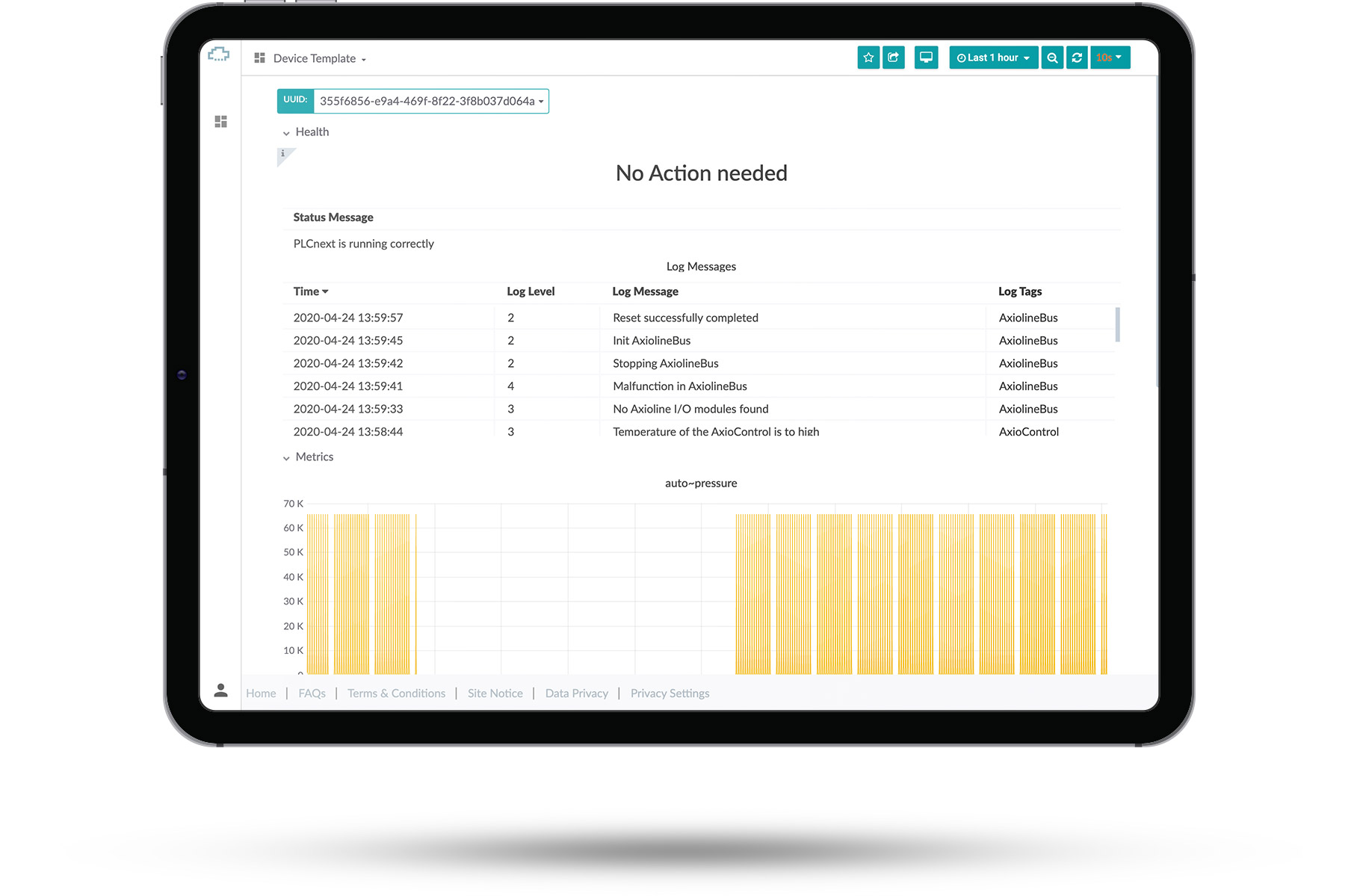
You can see an overview of the different default templates we currently offer.
Select one of them to see what they look like. After you’ve selected a dashboard you can change the UUID of the device you’re looking at in the top left corner.
There you can see basic information about your devices and check if they are running. These premade templates can’t be edited or removed.
This article contains:
Select data
Select visualization
General options
To get started with creating your own dashboards, please click the small user icon in the bottom left corner, click the “Switch” button and then press the small “switch to” button right behind your email address.
From that point on, you’ve switched to your personal organization, which allows you to create your own private dashboards, which only you can access.
Once you switched to your own organization you can create new dashboards by selecting the [+] button in the left sidebar. This will create an empty dashboard.
A dashboard consists of panels, which can be arranged in a number of ways. A new panel can be added to the dashboard by clicking the [Add Panel] at the top of the screen.
Select data
To retrieve data from your devices you must create a query. The query is sent to our cloud databases and provides you with the resulting data.
There is a graphical helper you can use to built your query in a point-and-click fashion.
- Click on [+] symbol on the left side of your screen, then on [Dashboard]
- Click on [Add Query] to start creating your new dashboard
- Select your data source from the dropdown right next to “Query”
- Build your query using the graphical editor
- Start by selecting a UUID in the “FROM”-row with clicking on the [+] right next to “where”
- Now select one of your UUIDs with a click on [select tag value]
- In the “FROM”-row, click now on [select measurement] so select what data should be displayed in your dashboard
- In the “SELECT”-row you now can change the field of the data inside the graph with clicking on the [+] next to “mean”
- In the “GROUP BY”-row you can set the interval of the data inside the graph
- You can give your data a new alias, with typing in a name in the row “ALIAS BY”
- If your data is written in a smaller frequency than in the “GROUP BY”-row, you can set it here
If there is anything wrong with your query, check the red exclamation mark at the top left of your panel
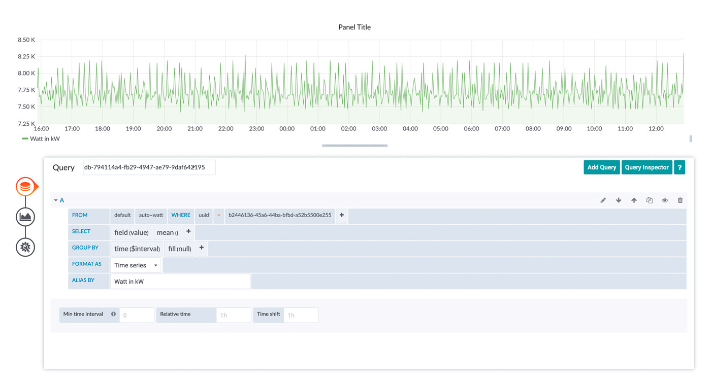
This is the easiest way of visualization, what you select depends on what you want to see. The best way to learn how the methods work is to try them out.
Select visualization
Click on the graph at the left side of the panel you worked with so far
This tool enables you to personalize the graphic. Click on the box [Graph] next to Visualization
Now you could choose which visualization you want to have for your measurement. There are a few visualization options that can be chosen from. It should be noted that not every visualization is suitable for every type of data.
What you see depends on what you select. The best way to learn how the methods work is to try them out.

You can also add new visualization option using plugins or remove old ones you don’t need.
After Choosing a Visualization you can edit it to the extend you need to. Every Visualization has different settings ranging from changing the name to visualizing your data in different ways.
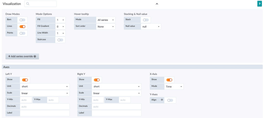
As an example, here you see the options for the Graph Visualization.
Now you can edit the visualization to the format you need. You could change the “Draw Mode” from Line to Bar, fill gaps with data, change the unit or scales of axes.
Just by trying the different type of options, you should get a greater understanding on how to make dashboards and personalize them.
General Options
In the box next to “Title” you can select the name of your Panel.
The option “Transparent” gives you the choice between a transparent and a nontransparent panel.
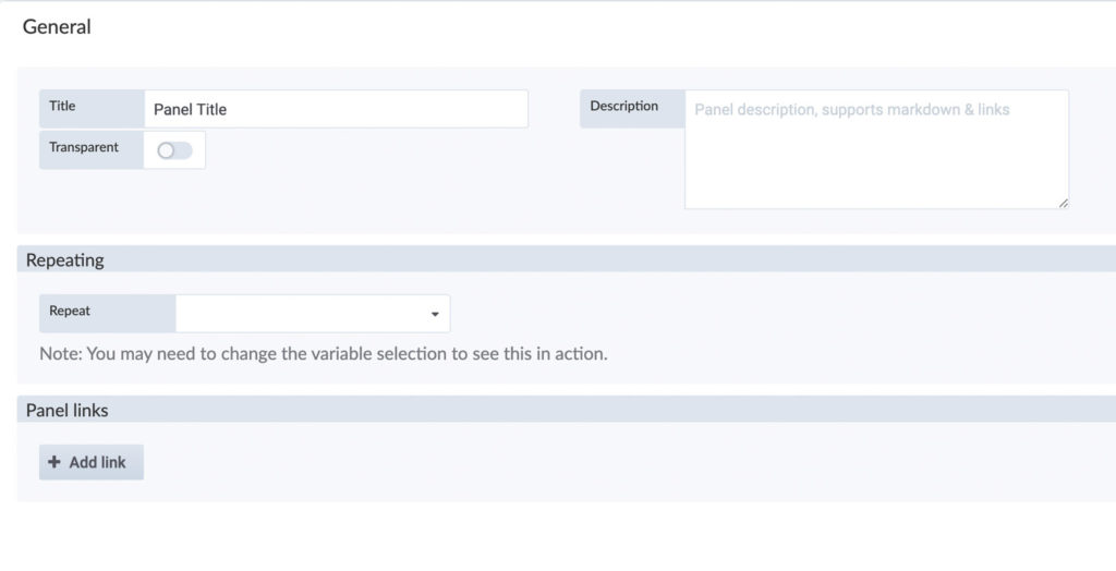
If you want, you can add a description, it supports markdown and links.
Exporting data from the Time Series Data Service as a CSV file is very simple.
Open any dashboard in which you can find a panel with the corresponding data. If you have not yet created your own dashboards, you can also use the Device Template.
Navigate to the panel with the data (metric) you want to export. Here, click on the name of the panel to open the context menu. Here, click on “Inspect” and then on “Data”.
Here you can export the data as a CSV file. The data displayed will always be exported, so if you want a different time period than the one initially set, you must change the time period before exporting.
The template dashboards can not be modified. Every modification you make here, will be revoked after a reload of the page.
You can export the templates and import them as your own custom dashboard, where you can also apply changes.
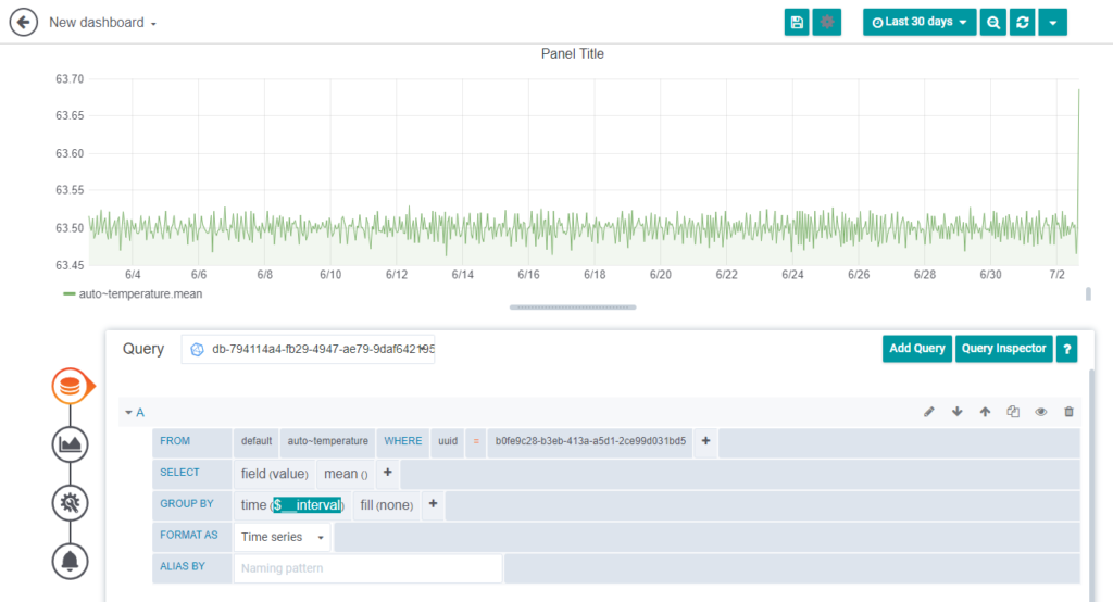
Our cloud system delivers data to your browser where the data is rendered and displayed. We limit the maximum number of data points for each query to 20000 points. Please note, that querying more data points for a single query is not providing much information, because your screen resolution likely does not have the resolution to display all of the data anyway. The limitation keeps processing time in the browser in check and results in a more snappy response of the user side.
If you want to view a larger time range, where you would end up with more than 20000 data points, we recommend you have a look at the grouping and aggregation parameters for the queries. Our template dashboards do this by default. You can choose a grouping interval to suit your needs, but it usually suffices to use the “$__interval” range. This will take the selected time range, your screen resolution and size of the panel into account and our database will aggregate the data for you. You can choose different aggregation options through the query editor. The benefit of this is, that the load is shifted to our cloud system and the amount of data which must be transferred to your browser is reduced. This also results in much smaller workload for your browser resulting in a better user experience. Have a look at the following screenshot for an example:
Time Series Data Alerting allows you to receive notifications of certain threshold violations in the Time Series Data Service. You can also receive these messages when you are not actively working in the Time Series Data Service, for example, by email or messenger.
You can create alerts so you get notifications when a certain rule is fulfilled, for example you could get an email when your device’s temperature is above 64 degrees.
- Navigate to the panel you want to add or edit an alert rule for, click the title, and then click [Edit].
- On the Alert tab, click [Create Alert]. If an alert already exists for this panel, then you can just edit the fields on the Alert tab.
- Fill out the fields.
- Name: Enter a descriptive name. The name will be displayed in the Alert Rules list.
- Evaluate every: Specify how often the scheduler should evaluate the alert rule.
- For: Specify for how long the query needs to violate the configured thresholds before the alert notification triggers
- Now choose your conditions, specify a query
- When: Controls how the values for each series are reduced to a value that can be compared against the threshold. Click on the function to change it to another function.
- Of: Specify a time range. The letter defines what query to execute from the Query tab. “(A,5m,now)” means 5 minutes ago to now. You can also do ”(A,10m,now-2m)” to define a time range that will be 10 minutes ago to 2 minutes ago.
- Is Above: Defines the type pf threshold and the threshold value. You can click to change the type of threshold.
- You can now set the ways of how you want to be notified in the “Notifications” area.
- With a Click on the [ + ] right next to “Send to” you can chose a notification way
- Fill in the message you want to get in case a threshold is violated.
- Tags: Specify a list of tags to be included in the notification
- Navigate to the panel within your dashboard using the appropriate alert.
- Click the name of the panel, and click [Edit].
- Click on the “bell” on the left side of the setting options to get to your configured alerts.
- Click [Delete] in the upper right corner of the setting area.
- Confirm the deletion with a click on [Delete] – The Panel will still be available you are only deleting the alarm.
- Open the Time Series Data Service and navigate to the “Notification channels” with a click on the “bell” in the left side navigation
- Click on [New channel] to set up a new notification channel.
- Here you have to fill in some settings:
- Name: Enter a descriptive name, the name will be displayed when you create a new Alert rule and choose a notification
- Type: Choose how the notification should be sent, for example Email, Slack, Microsoft Teams …
- Default: Use this notification for all alerts
- Include Image: Captures an image and include it in the notification
- Disable Resolve Message: Disable the resolve message [OK] that is sent when alerting state returns to false
- Send reminders: Send additional notifications for triggered alerts
As a reminder you can hover over the “i” symbol to receive more information
(optional): to test if the notification gets send to you click “Send Test” on the bottom.
The times of the data sent by the device must be sent in the UTC format. For this purpose the hardware clock must be set to UTC so that the values get the correct time stamp.
Because the data points that are uploaded have a certain resolution. In the end it’s a group of single data points. You can change the way it’s displayed in the visualization possibilities of the graph. Set Null value on the very right to “connected”.
If the “Evaluate every” and the “For” time have the same value, the alert may not be triggered until after the second cycle. This can be changed if the “For” value is set to a different value (e.g. 30s).

If you want to show average values in the Time Series Data Service, for example, you must specify from which group of data points this should be done. By default, the function is set to “Group by Time Period”, so you can start directly.


